SCSS Architecture: The System Behind Our Themes
A well-structured SCSS codebase isn't just tidy — it's faster to build, easier to maintain, and scales without pain. Here's how we structure ours and why every decision was made deliberately.
When a project grows past a few pages, CSS becomes the first thing that fights back. Specificity wars, duplicate values, a breakpoint defined in three different files. It's a familiar story. The way we've structured SCSS in our Mena theme wasn't arrived at overnight — it evolved through real projects, real deadlines, and real pain.
This post walks through our architecture layer by layer: what each folder does, why it's there, and the specific tools that make it work. If you're building WordPress themes or any CSS-heavy project, there's something here worth stealing.
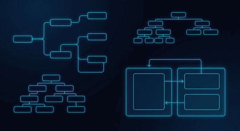
The Folder Structure
Everything lives under resources/scss/. The entry point is style.scss — a single file that does nothing but import. It never contains actual rules. Its only job is to declare the load order using the modern @use syntax:
@use 'abstracts' → @use 'vendor/normalize' → @use 'base' → @use 'layout' → @use 'blocks/index' → @use 'components' → @use 'elements' → @use 'pages'
That order matters. Abstracts (variables, mixins) must load before anything that uses them. Vendor resets come before our base. Layout before components. It reads like a dependency graph because it is one.
Abstracts: The Design Tokens Layer
The abstracts/ folder is the brain of the system. It outputs no CSS on its own — it's pure declarations. Variables, functions, mixins. Everything that other layers consume.
Variables. Breakpoints are defined once as a Sass map: xs: 440px, sm: 640px, md: 768px, lg: 1024px, xl: 1280px, xxl: 1536px. Colors are also a map — and this is where it gets interesting. We loop over that map to auto-generate both CSS custom properties (--color-primary) and utility classes (.color-primary, .background-primary). One source, three outputs.
The breakpoint mixin. Instead of writing raw media queries everywhere, we have a single mixin that handles min-width, max-width, ranges, and custom conditions. @include breakpoint(md) outputs @media screen and (min-width: 768px). @include breakpoint(xs, xl) gives you the range. @include breakpoint($to: lg) caps at 1023px. One consistent API, zero magic numbers scattered across files.
Fluid typography. This is one of the techniques we're most deliberate about. Instead of jumping between two fixed font sizes with a breakpoint, we use a CSS calc() formula that makes the font size grow linearly with the viewport width. A heading can be 2.5rem at 375px and smoothly reach 3rem at 1600px — with no sudden jump, no extra breakpoint, just a curve.
Fluid spacing. The same principle applied to margins and padding. A .content-block's top margin scales from 28px on mobile to 60px on desktop. The fluid-spacing() mixin takes a property name, a mobile value, and a desktop value and does the math. Blocks with backgrounds get matching fluid padding automatically.
Base: The Global Defaults
The base/ folder sets the ground rules. Normalize.css resets browser inconsistencies first. Then our base styles: box-sizing, line-height, font-family, link defaults, paragraph margins. Typography is generated programmatically — we define a map of heading sizes (min and max for each h1–h6), then loop through it applying the fluid-type mixin to each. Adding or changing a heading size is a one-line change in the map.
The _helpers.scss file contains our utility classes: layout helpers like .flex, .grid, spacing utilities like .mt-4, .gap-3, and display shortcuts. These aren't a replacement for Tailwind — they're a small, curated set of classes that cover 80% of layout needs without adding a full utility framework dependency.
Layout, Components, Elements
Layout handles structural shells: the grid system, the header, footer, content area, and WordPress default block styles. These are the big containers. Components are the reusable pieces that live inside layouts: navigation menus, post cards, social links. Elements are the atomic UI pieces: buttons, form inputs.
Buttons illustrate how we use BEM. The base class is .c-button. Variants are modifiers: .c-button--primary, .c-button--secondary, .c-button--bordered. An icon inside the button is an element: .c-button__icon. The structure is predictable. When a developer sees .c-button--primary, they know exactly where to look in the SCSS tree.
Blocks: The Gutenberg Layer
The blocks/ folder is special to our WordPress setup. Every custom Gutenberg block gets its own SCSS partial, and that partial is automatically registered when a new block is scaffolded via our create-block.js script. The blocks/index.scss file is updated automatically — developers never touch it by hand.
Block styles are isolated. A block's styles don't leak into other blocks. This is critical as a theme accumulates 20, 30, or 50 blocks — you need confidence that changing one block's CSS doesn't ripple into something unexpected.
Why @use Instead of @import
The entire system uses the modern @use and @forward APIs instead of the legacy @import. This isn't just preference — it solves a real problem. With @import, every variable, mixin, and function was globally available everywhere. That sounds convenient until you're debugging a specificity issue caused by a mixin you didn't know was being applied.
With @use, every file explicitly declares what it needs. Nothing bleeds in silently. A component file that needs the breakpoint mixin writes @use '../abstracts' as * at the top. That's its dependency contract. The system is transparent, and that transparency makes refactoring safe.
The Payoff
A well-structured SCSS system pays dividends in three ways. Speed: developers know exactly where to put new styles and where to find existing ones. No hunting, no guessing. Consistency: spacing, typography, and colors come from one source of truth. Changing the primary color is a one-line change in _variables.scss. Maintainability: when a project comes back six months later for updates, the codebase is still navigable. You're not inheriting a mess.
The Mena theme's SCSS isn't perfect — no system is. But every decision in it was made intentionally, and that intentionality is what separates a codebase that scales from one that collapses under its own weight.